
Designing connection, from families to facilities.
I joined Pigeonly in 2015 as a Graphic Designer working on marketing and brand. My role grew into Head of UX & Design, with responsibility spanning consumer products, internal tools, and a web platform for correctional-facility staff.
2015–2022 · Graphic Designer → Head of UX & Design
Chapter 01
Establishing the brand, expanding the role
Role progression · Graphic Designer → Head of UX & Design
At a seed-stage startup, design needs extended across the business. I began with marketing and brand work, helping establish how Pigeonly presented itself to the families it served.
As my role expanded, I moved deeper into the product: how people found an incarcerated loved one, chose a service, and sent correspondence. I became Head of UX & Design while continuing to design the interfaces and workflows directly.
The surviving UI foundations show part of that broader practice: making recurring actions and form states consistent across the product.
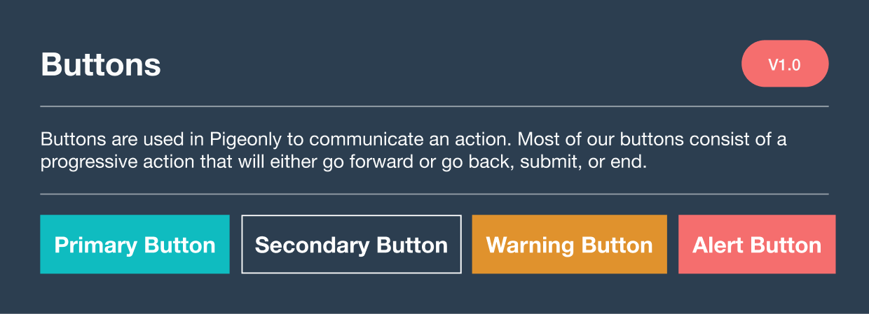
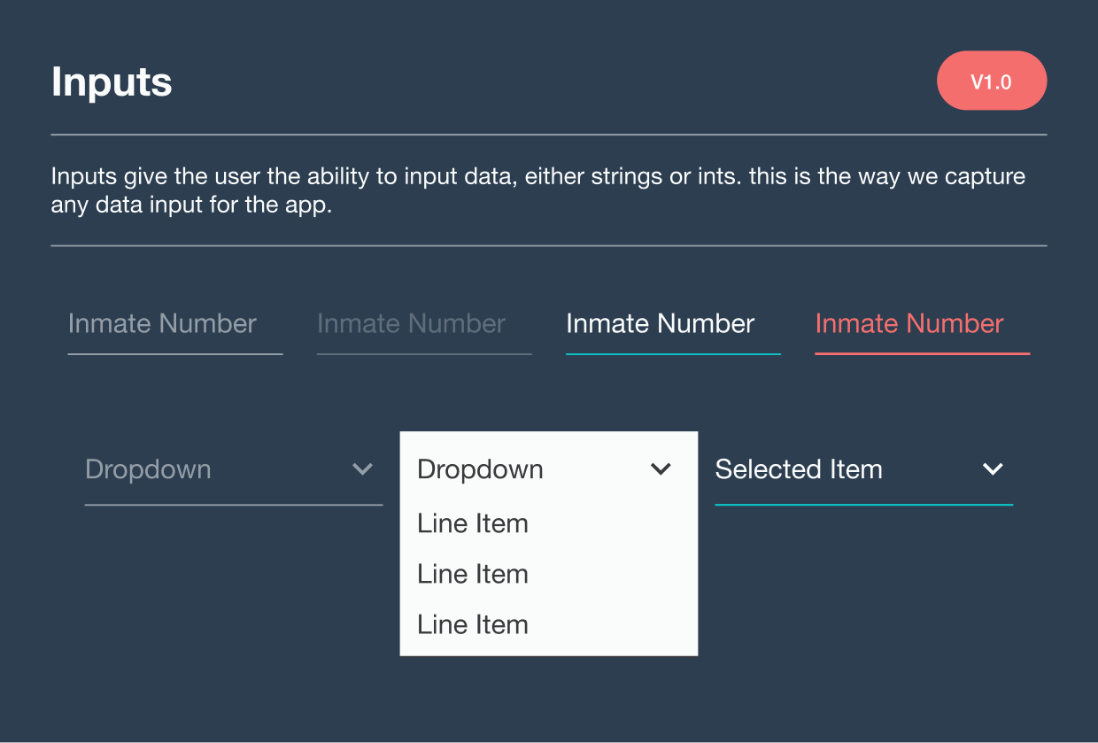
These surviving documents show later interface foundations for actions and form states. They are not dated 2015 brand evidence.
Chapter 02
Recognizing the fragmentation
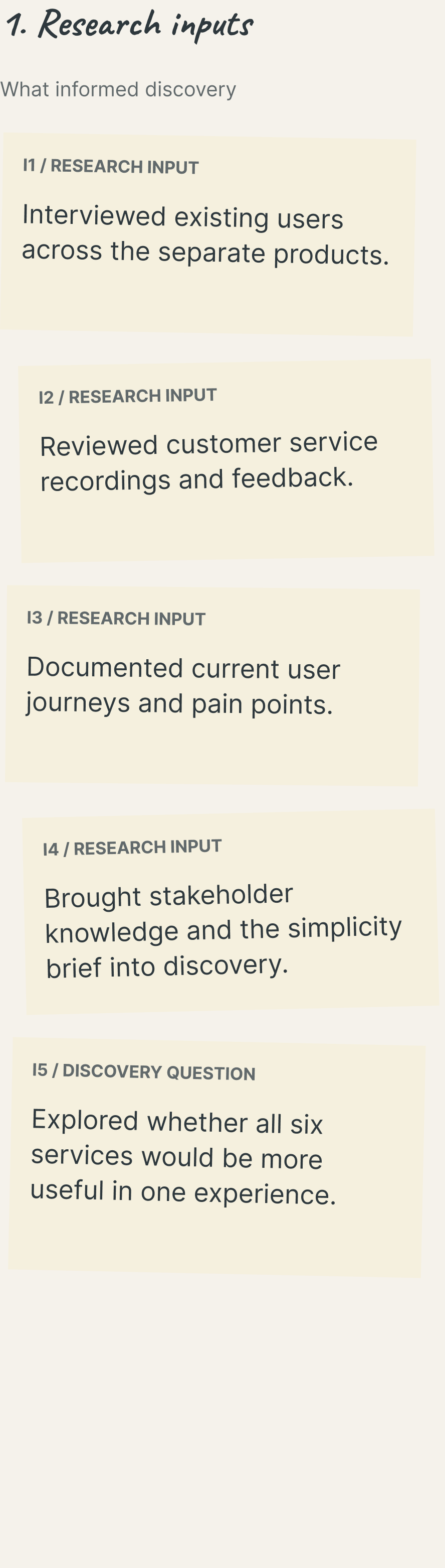
Pigeonly’s consumer services had grown as separate experiences. Related tasks lived across different websites, with variations in navigation and visual language. Moving from one service to another introduced complexity for people trying to stay connected with the same loved one.
The consolidation effort brought six services into the same design conversation. I wanted to make them easier to find and use together, without making every service feel like a separate product to learn.
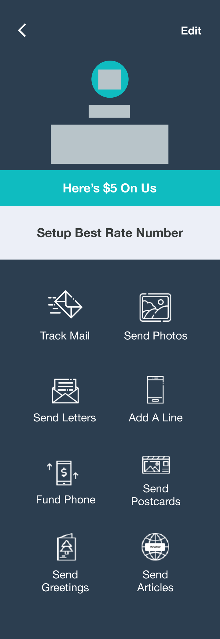
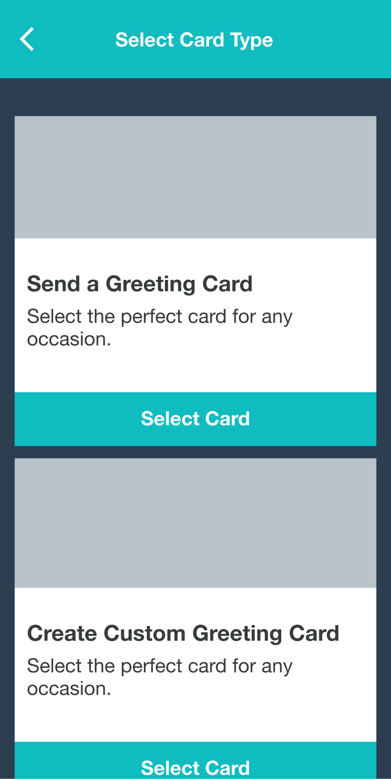
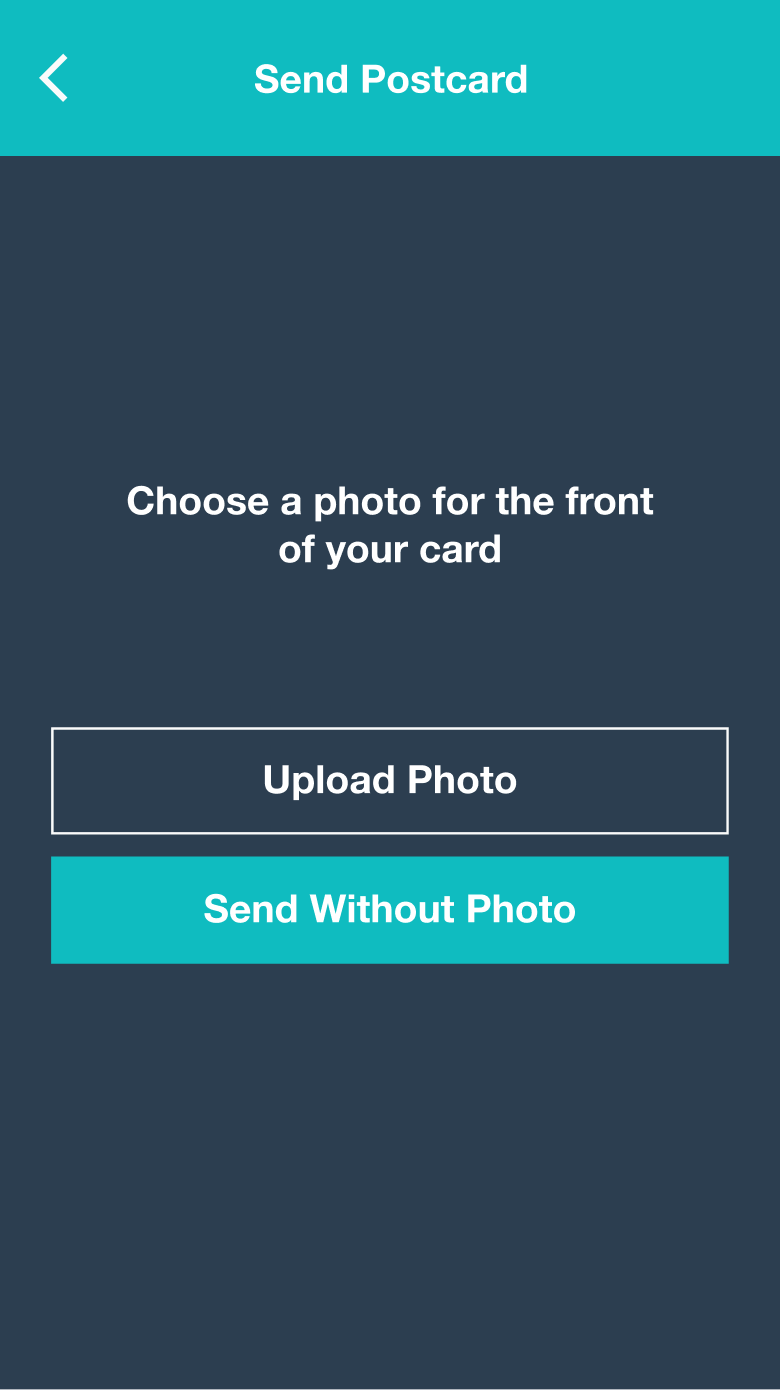
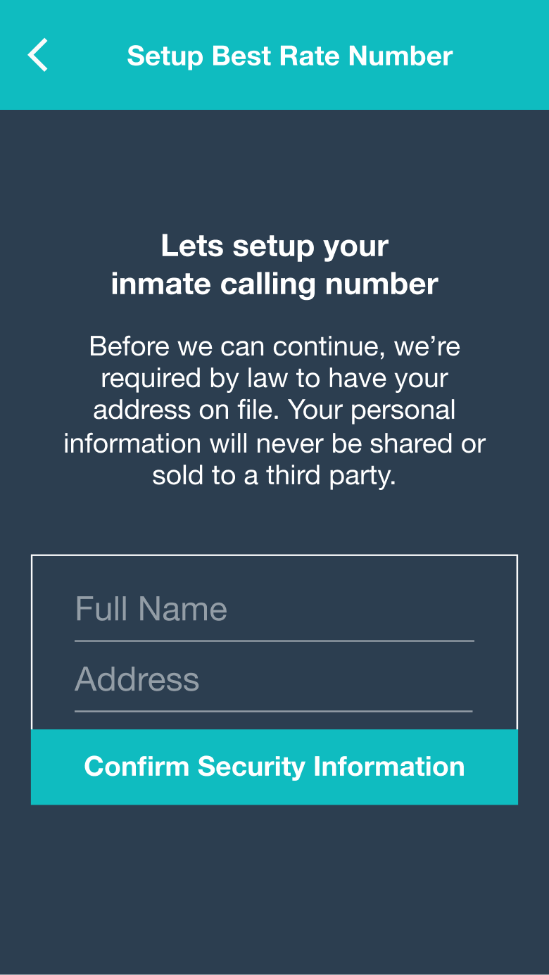
Related service entry points.
Chapter 03
Validating a connected experience
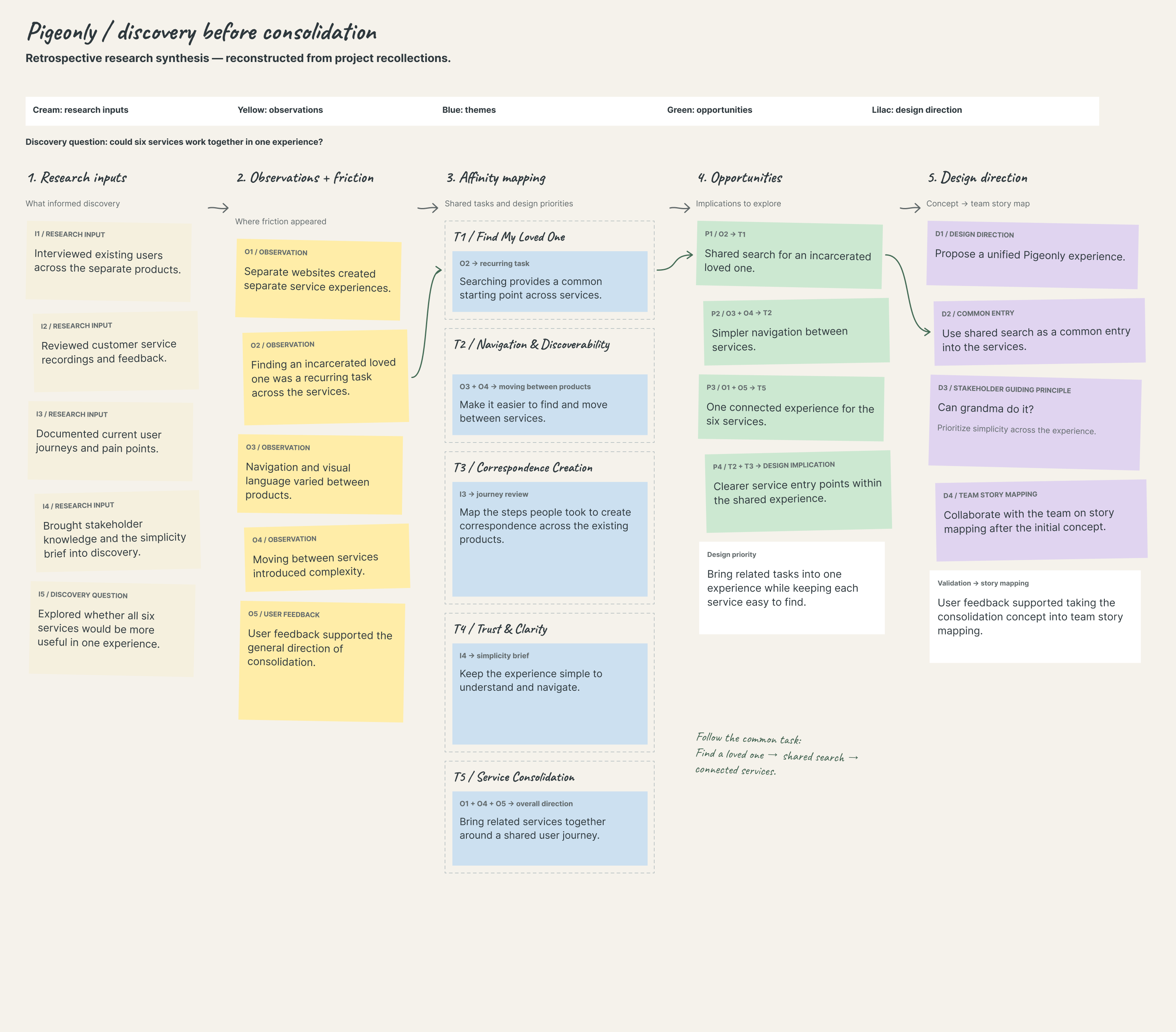
I interviewed existing users across the separate products and reviewed customer service recordings and feedback. I documented their journeys and pain points, then explored whether having the services in one experience would be useful.
Searching for an incarcerated loved one came up as a recurring task across the services. That gave the consolidation concept a practical starting point: a shared search experience, followed by clearer ways to enter each service.
User feedback supported the general direction. The guiding principle was “Can grandma do it?” It kept simplicity at the center of the work. After the initial concept, I collaborated with the team on story mapping.
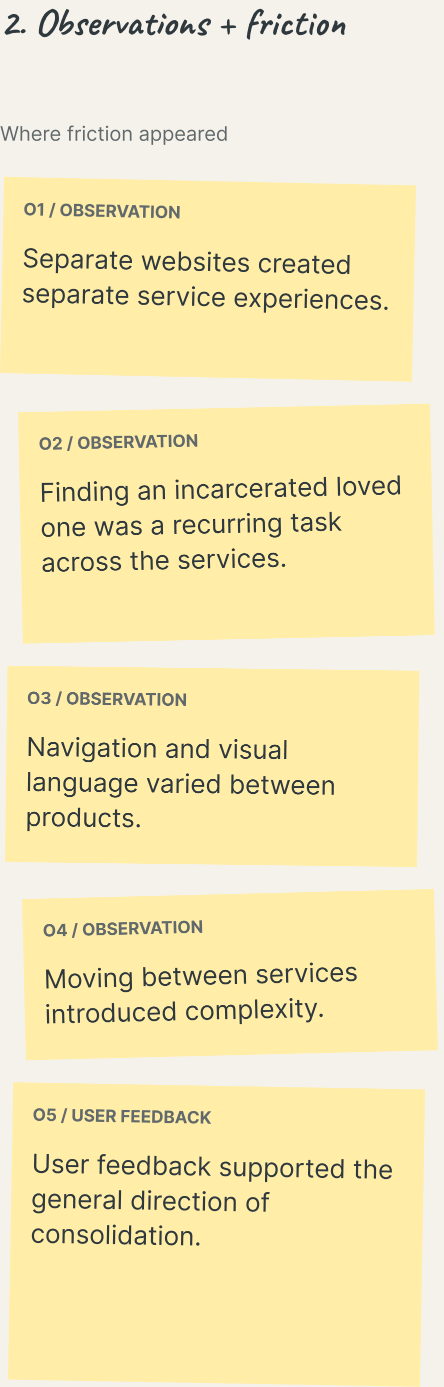
The synthesis moves from research inputs and observations into affinity themes, opportunities, and a design direction. Searching for a loved one appears as a recurring task that connects a shared theme to a common entry point.
Inputs
Observations
Affinity themes
Opportunities
Design direction
Open full-resolution research board (2940×2580 WebP; opens in a new tab)
Text equivalent · Research synthesis
Retrospective research synthesis
Reconstructed from project recollections. Clusters describe the recalled approach; they are not recovered workshop transcripts.
1. Research inputs
What informed discovery.
- I1 / Research input. Interviewed existing users across the separate products.
- I2 / Research input. Reviewed customer service recordings and feedback.
- I3 / Research input. Documented current user journeys and pain points.
- I4 / Research input. Brought stakeholder knowledge and the simplicity brief into discovery.
- I5 / Discovery question. Explored whether all six services would be more useful in one experience.
2. Observations + friction
Where friction appeared.
- O1 / Observation. Separate websites created separate service experiences.
- O2 / Observation. Finding an incarcerated loved one was a recurring task across the services.
- O3 / Observation. Navigation and visual language varied between products.
- O4 / Observation. Moving between services introduced complexity.
- O5 / User feedback. User feedback supported the general direction of consolidation.
3. Affinity mapping
Shared tasks and design priorities.
- T1 / Find My Loved One
Searching provides a common starting point across services. - T2 / Navigation & Discoverability
Make it easier to find and move between services. - T3 / Correspondence Creation
Map the steps people took to create correspondence across the existing products. - T4 / Trust & Clarity
Keep the experience simple to understand and navigate. - T5 / Service Consolidation
Bring related services together around a shared user journey.
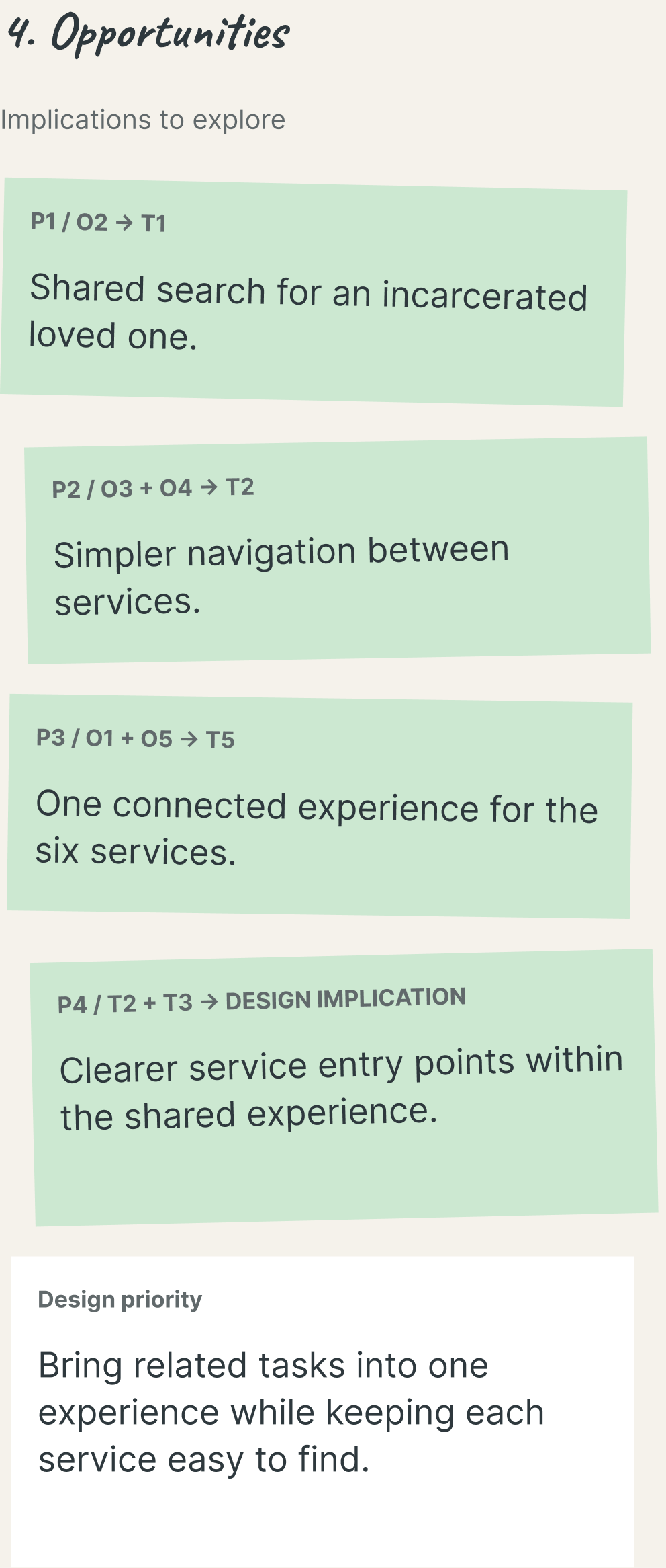
4. Opportunities
Implications to explore.
- P1. Shared search for an incarcerated loved one.
- P2. Simpler navigation between services.
- P3. One connected experience for the six services.
- P4 / Design implication. Clearer service entry points within the shared experience.
Design priority. Bring related tasks into one experience while keeping each service easy to find.
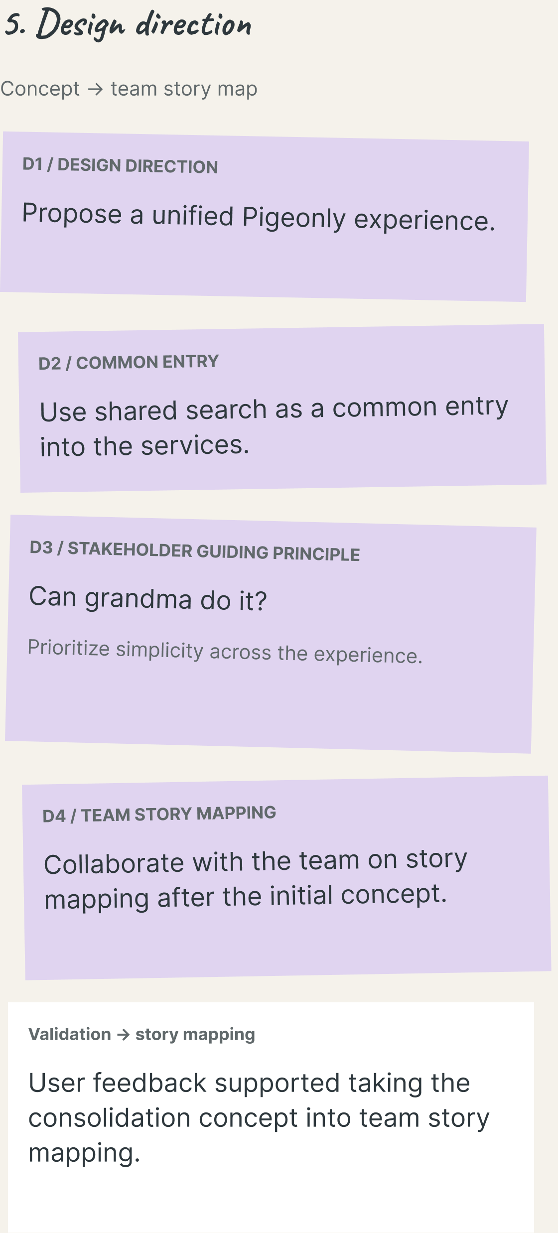
5. Design direction
Concept → team story map.
- D1 / Design direction. Propose a unified Pigeonly experience.
- D2 / Common entry. Use shared search as a common entry into the services.
- D3 / Stakeholder guiding principle. “Can grandma do it?” Prioritize simplicity across the experience.
- D4 / Team story mapping. Collaborate with the team on story mapping after the initial concept.
- Validation → story mapping. User feedback supported taking the consolidation concept into team story mapping.

O2 / Recurring task
Finding an incarcerated loved one recurred across the services.
T1 / Shared theme
Find My Loved One
P1 / Design opportunity
Shared search across services.
D2 / Design direction
A common entry into the unified experience.
Text equivalent · Search-to-design thread
O2 / Recurring task
Finding an incarcerated loved one recurred across the services.
T1 / Shared theme
Find My Loved One
P1 / Design opportunity
Shared search across services.
D2 / Design direction
A common entry into the unified experience.
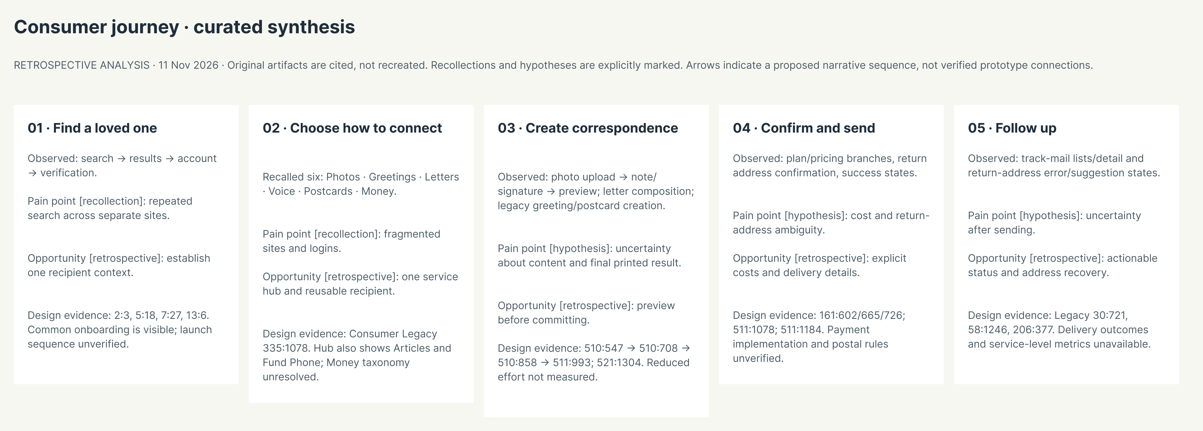

Retrospective consumer journey covering discovery, service selection, correspondence creation, confirmation, and follow-up.
Text equivalent · Consumer journey map
Consumer journey · curated synthesis
Retrospective analysis. Original artifacts are cited, not recreated. Recollections and hypotheses are explicitly marked. Sequence arrows describe a proposed narrative, not verified prototype connections.
- 01 · Find a loved one.
- Observed: search → results → account → verification.
- Pain point [recollection]: repeated search across separate sites.
- Opportunity [retrospective]: establish one recipient context.
- 02 · Choose how to connect.
- Recalled six: Photos · Greetings · Letters · Voice · Postcards · Money.
- Pain point [recollection]: fragmented sites and logins.
- Opportunity [retrospective]: one service hub and reusable recipient.
- Surviving hub labels also include Articles and Fund Phone; a dedicated Money screen was not located for this exhibit.
- 03 · Create correspondence.
- Observed: photo upload → note/signature → preview; letter composition; legacy greeting/postcard creation.
- Pain point [hypothesis]: uncertainty about content and final printed result.
- Opportunity [retrospective]: preview before committing.
- 04 · Confirm and send.
- Observed: plan/pricing branches, return address confirmation, success states.
- Pain point [hypothesis]: cost and return-address ambiguity.
- Opportunity [retrospective]: explicit costs and delivery details.
- 05 · Follow up.
- Observed: track-mail lists/detail and return-address error/suggestion states.
- Pain point [hypothesis]: uncertainty after sending.
- Opportunity [retrospective]: actionable status and address recovery.
Chapter 04
Designing the unified consumer experience
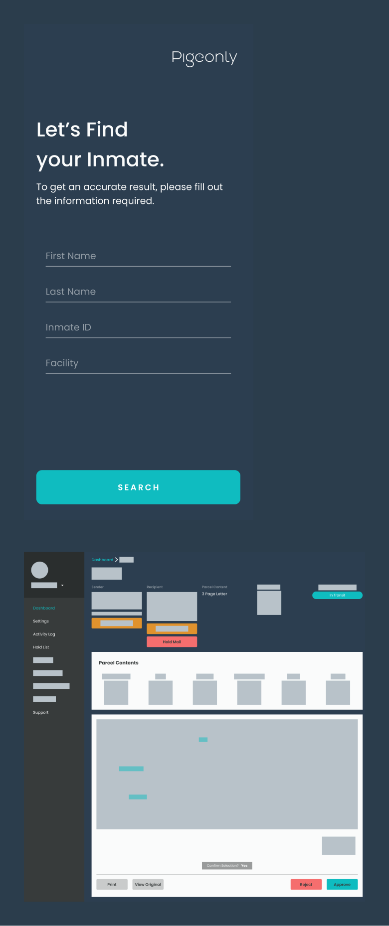
I designed a unified consumer experience around the tasks people were already trying to complete: find their loved one, establish an account, choose a service, and create something to send.
The shared entry sequence connected search, recipient selection, account creation, and verification. For photo correspondence, I worked through upload, an optional note, and order preview. Letter creation was a separate companion workflow for composing and sending a letter.
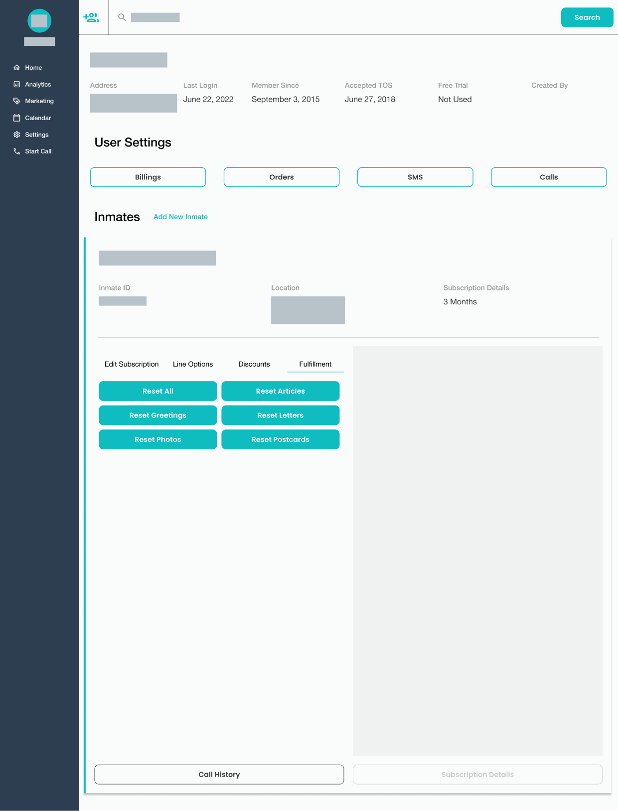
The work also extended beyond the moment of sending. Return-address confirmation, parcel tracking, and internal account and fulfillment surfaces connected the consumer journey to the teams supporting it.
Shared search and account entry
Search, recipient selection, account creation, and verification formed a shared entry sequence before service-specific work began.
01 · Search
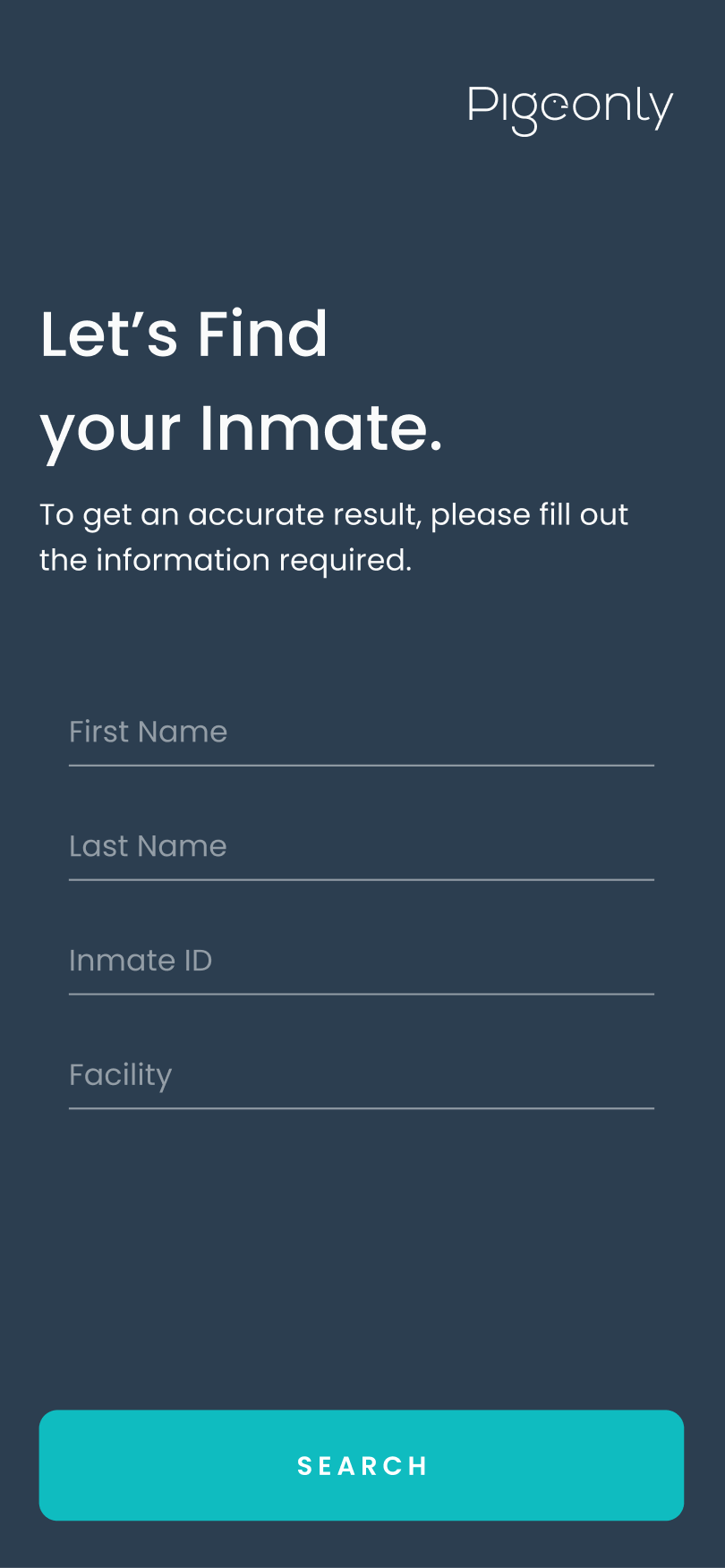
A recurring task became a shared entry point.
02 · Results
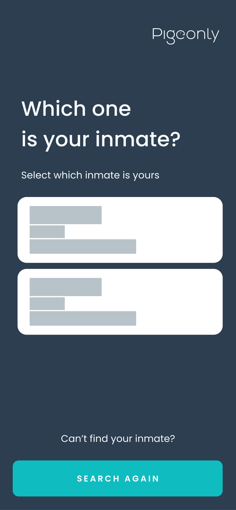
Select the intended recipient before continuing.
03 · Account
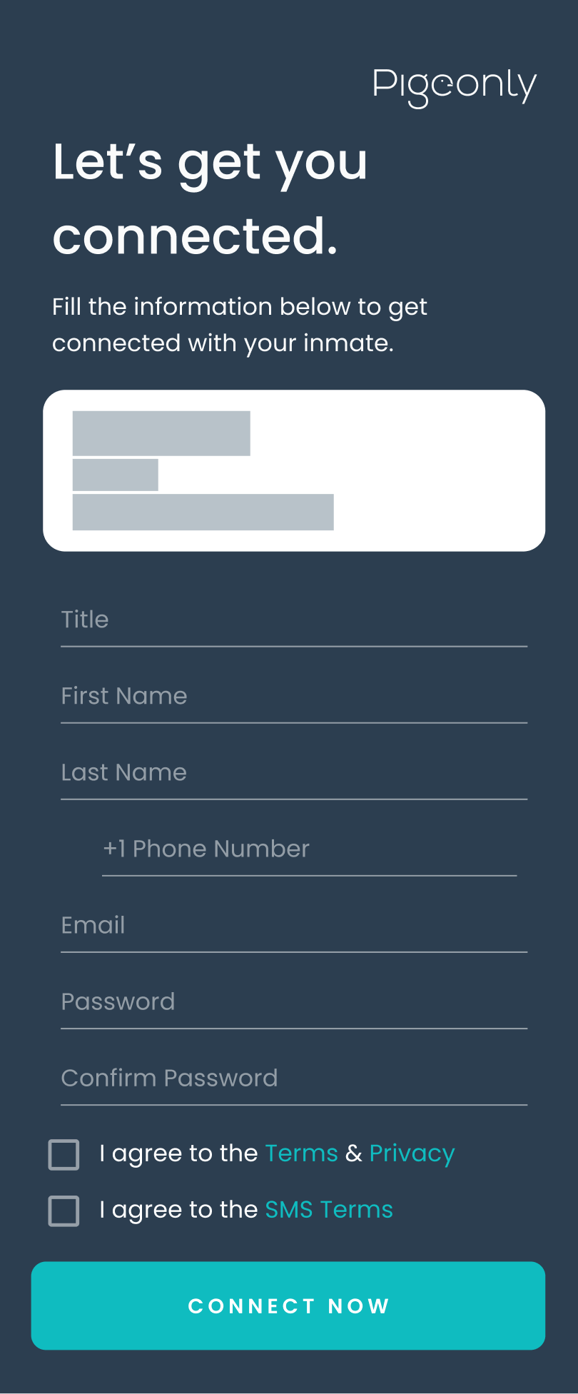
Connect recipient discovery to account creation.
04 · Verification
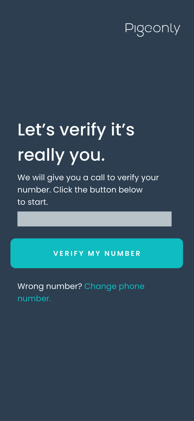
Verify the account before continuing.
Correspondence creation
Photo correspondence followed its own path: upload a photo, add an optional note, then review the assembled photo order. Letter creation remained a separate companion workflow.
01 · Upload

Choose a photo source.
02 · Optional note
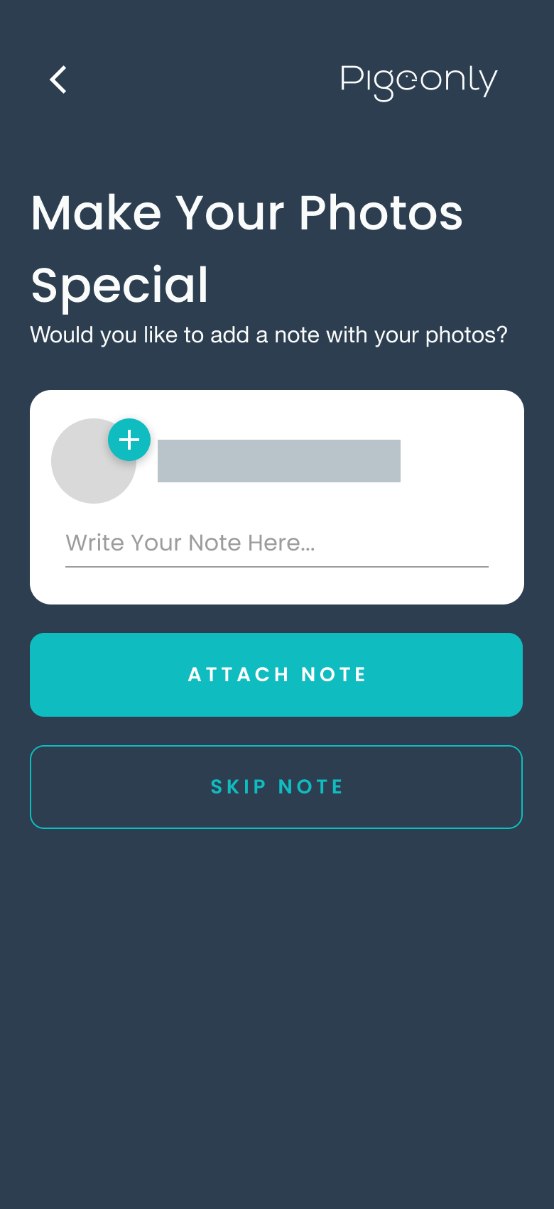
Add a personal note before review.
03 · Photo order preview
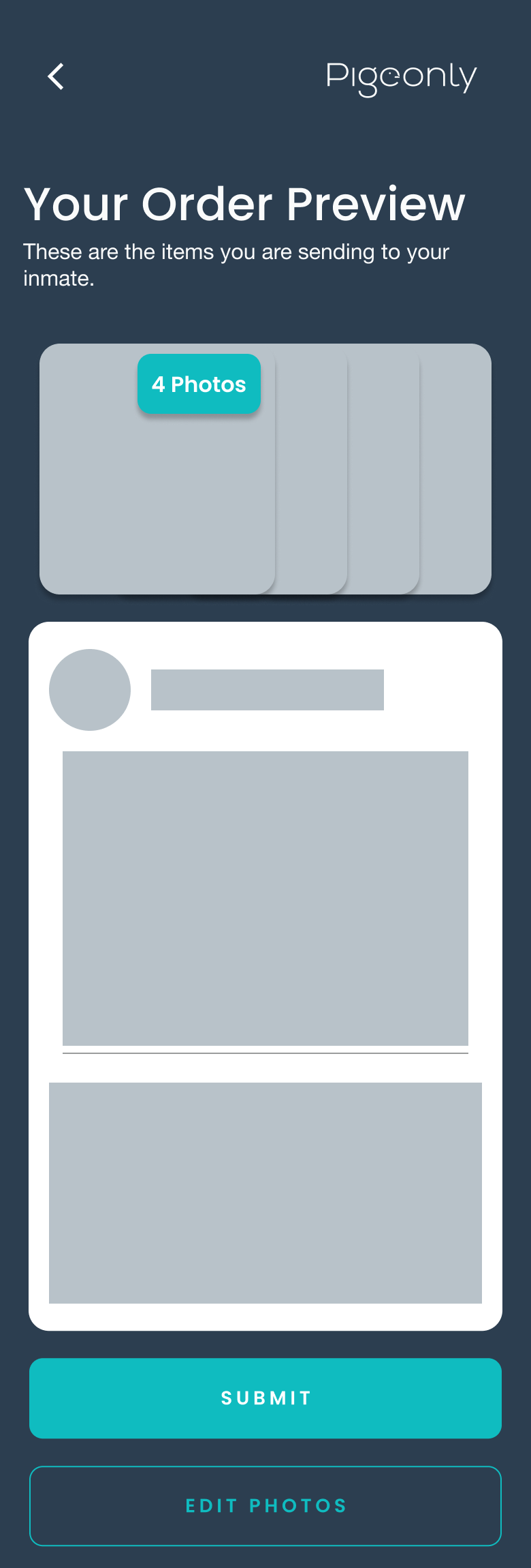
Review the assembled correspondence before submitting.

Fulfillment and follow-through
Return-address confirmation, parcel tracking, and internal fulfillment connected the consumer journey to the teams supporting it.
01 · Return address
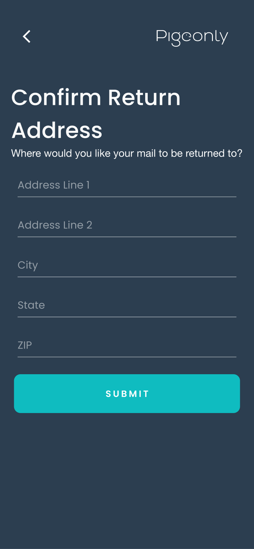
Confirm where undeliverable correspondence should return.
02 · Tracking
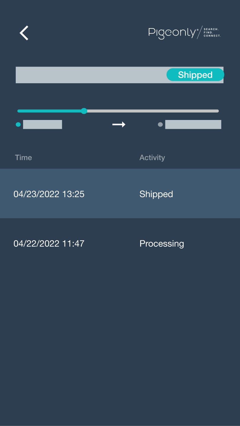
Make the next stage of the journey visible after sending.
Chapter 05
Expanding into Pigeonly Corrections
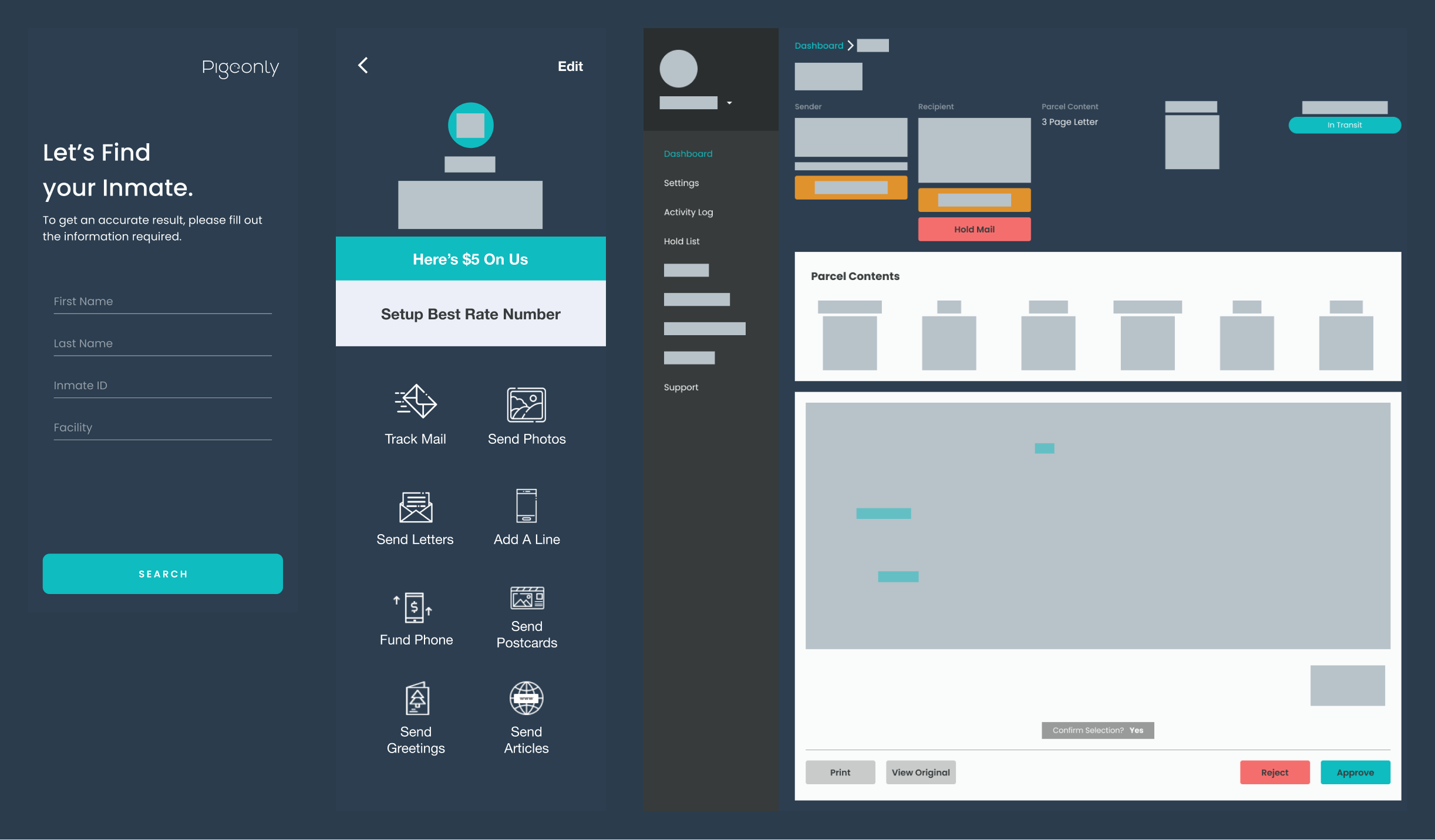
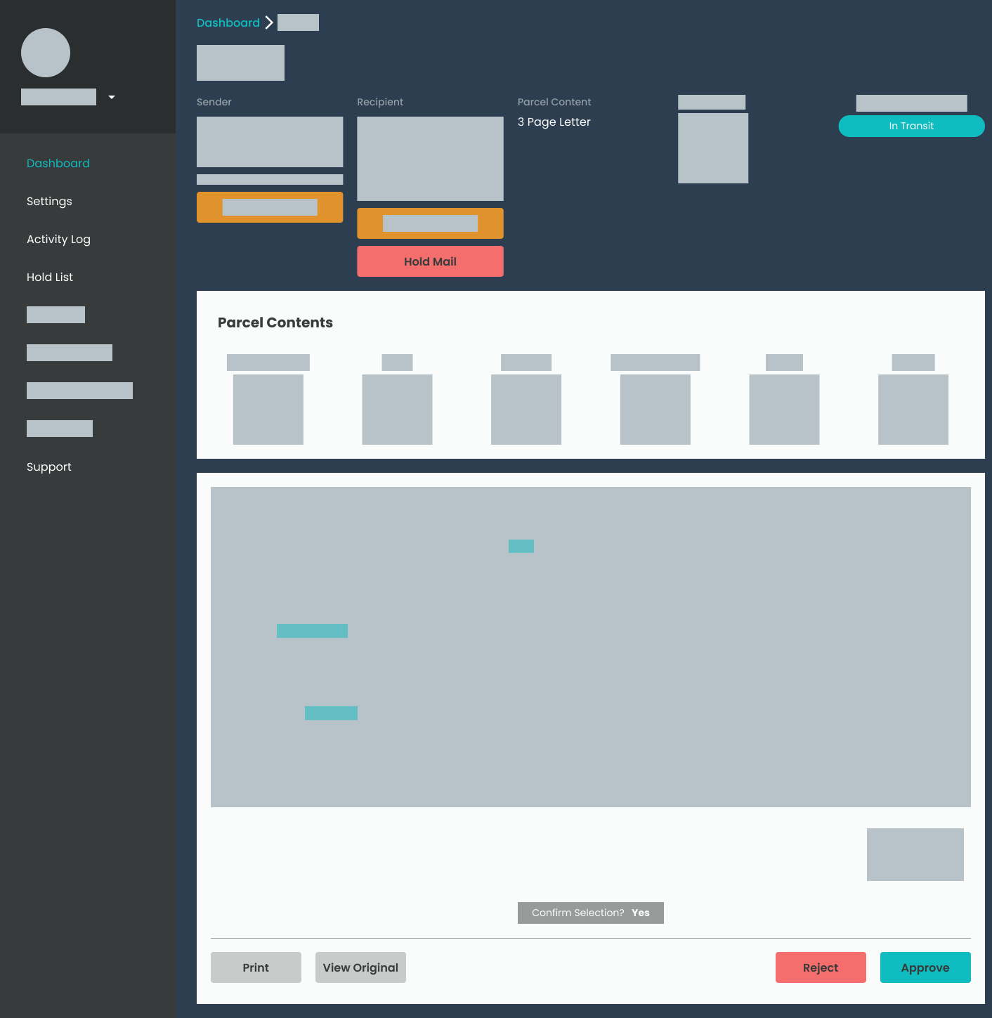
The next challenge was designing for the staff receiving and reviewing correspondence. I designed Pigeonly Corrections, a web portal for facility staff, mailroom employees, and administrators.
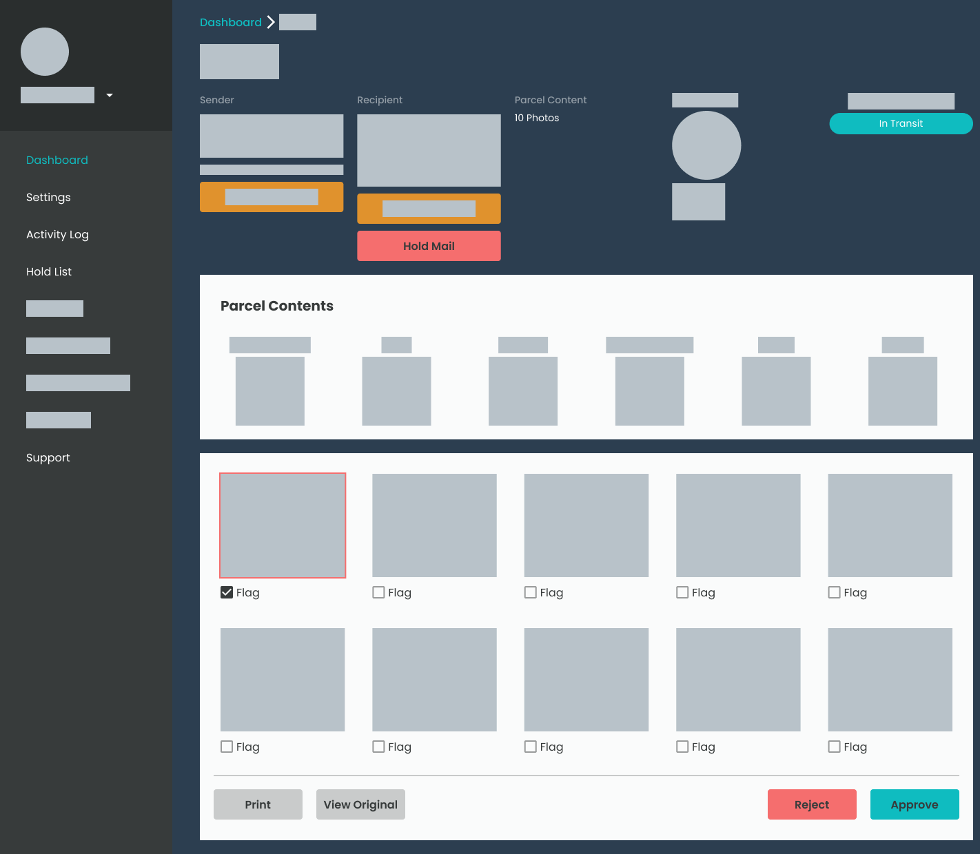
The workspace brought sender and recipient context together with digitized correspondence and decisions such as approve, reject, or hold. I designed the platform’s visual language, flows, and prototypes, and worked through internal testing and feedback from facilities.
This was a different environment from the consumer services. Existing technology and institutional workflows shaped what would be practical to use. A web portal let me design around those constraints while keeping the correspondence-review task clear.
Original desktop staff-review workspace.
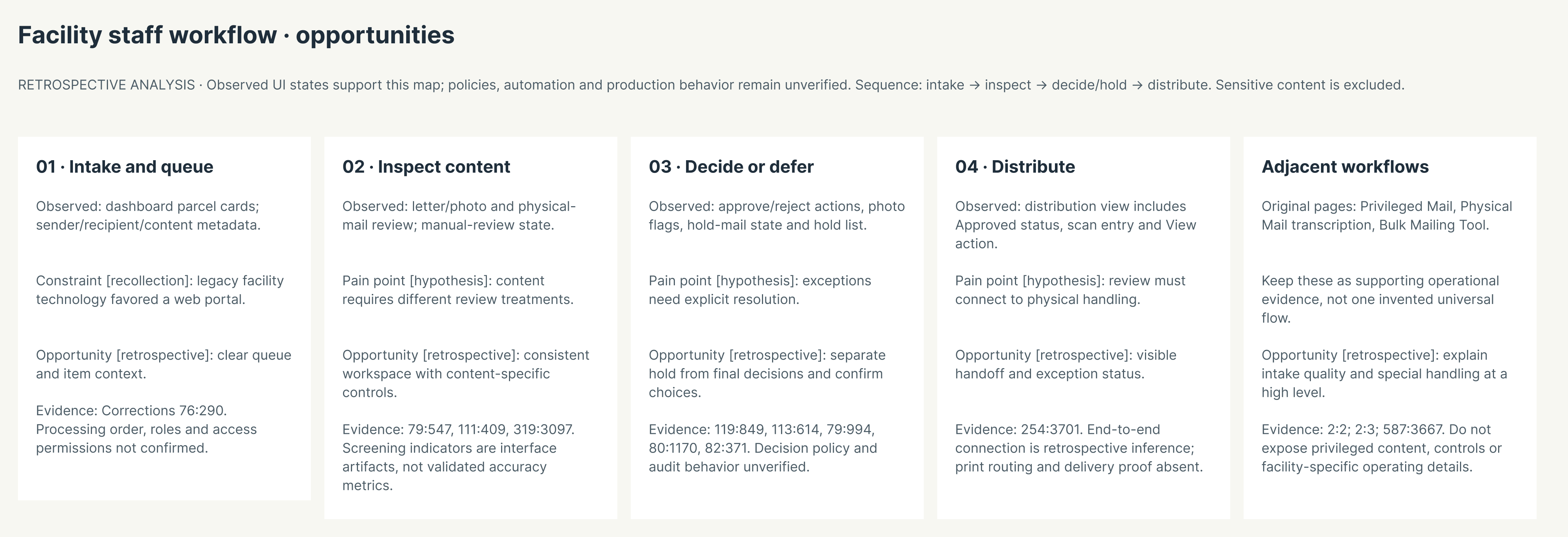

Retrospective facility workflow from intake through inspection, decision or hold, and distribution.
Text equivalent · Facility staff workflow
Facility staff workflow · opportunities
Retrospective analysis. Observed UI states support this map; policies, automation, and production behavior remain unverified. Sequence: intake → inspect → decide/hold → distribute. Sensitive content is excluded.
- 01 · Intake and queue.
- Observed: dashboard parcel cards; sender/recipient/content metadata.
- Constraint [recollection]: legacy facility technology favored a web portal.
- Opportunity [retrospective]: clear queue and item context.
- 02 · Inspect content.
- Observed: letter/photo and physical-mail review; manual-review state.
- Pain point [hypothesis]: content requires different review treatments.
- Opportunity [retrospective]: consistent workspace with content-specific controls.
- Screening indicators shown in the interface are not validated accuracy metrics.
- 03 · Decide or defer.
- Observed: approve/reject actions, photo flags, hold-mail state and hold list.
- Pain point [hypothesis]: exceptions need explicit resolution.
- Opportunity [retrospective]: separate hold from final decisions and confirm choices.
- 04 · Distribute.
- Observed: distribution view includes Approved status, scan entry and View action.
- Pain point [hypothesis]: review must connect to physical handling.
- Opportunity [retrospective]: visible handoff and exception status.
- Adjacent workflows.
- Original pages included Privileged Mail, Physical Mail transcription, and a Bulk Mailing Tool.
- Keep these as supporting operational evidence, not one invented universal flow.
- Opportunity [retrospective]: explain intake quality and special handling at a high level.
Chapter 06
Owning design across the business
Pigeonly expanded my understanding of design ownership. I moved from marketing and brand into consumer workflows, internal operations, and a platform for a different institutional audience. The work required me to connect the customer experience to the business and operational context around it.
I recall Pigeonly serving approximately 80,000 users and Pigeonly Corrections being deployed at around 30 facilities. These are approximate personal recollections, not independently verified measurements.
Alongside Pigeonly, I took on short consulting engagements through founder and accelerator networks, advising on UX/UI flows and product direction. That work reinforced a habit I carried into later roles: understand the problem, examine the journey, and work closely with the people building the product.