
Designing for a world of experiences
Scalable foundations. Local guest experiences.
Team King Content · Contract · Global Design System, USJ and Shanghai
I connected systems architecture with hands-on product UX, advocating for consistent design intent from Figma to production.
EVIDENCE KEY
- Shipped: color architecture + USJ changes
- Proposed: Shanghai player
- Recreated: fictional-brand examples
Chapter 01
A fragmented global foundation
The first users of the system were the designers working inside it. I audited GDS and internal workflows to understand where brand color and component usage diverged.
PROCESS / INTERNAL WORKFLOW AUDITS
01A / AUDIT THE WORK, NOT JUST THE LIBRARY
01 / Inspect
Review existing GDS patterns and how designers applied brand color.
02 / Compare
Trace differences between component intent, local overrides and production.
03 / Define
Give recurring color needs a semantic role, then check component coverage.
BEFORE / LOCAL COLOR DECISIONS
Page-level choices
Brand color assigned where it was available, with intent spread across screens.
Component-level exceptions
Different foreground/background and inverse relationships needed reconciliation.
Designer handoff
A visual match alone could hide different production behavior.
AFTER / ROLES THAT TRAVEL
Brand context
A mode supplies the brand palette without redefining the component.
Semantic relationship
Background, foreground and inverse describe how colors work together.
Coverage + parity
Check the smaller GDS components and align design with implementation.
Retrospective audit synthesis · reconstructed examples, not screenshots of a historical audit deliverable.
01 / Collaborate
Design partner: component coverage. IP creatives: brand ramps and color fidelity.
02 / Work within constraints
Legacy inverse/reverse tokens, lengthy IP reviews and an existing Tridion implementation.
Chapter 02
Give color a purpose
I built the initial architecture; my design partner helped find component-level gaps. The goal was to describe intent once, then adapt it to each brand context.
SHIPPED / SEMANTIC COLOR ARCHITECTURE
02A / PRIMITIVES → SEMANTIC ROLES → COMPONENT TOKENS
1 / Primitives
Brand ramps + transparency values
The available color vocabulary.
2 / Semantic roles
Background · Foreground · Inverse
The purpose of a color in context.
3 / Component tokens
Header · Page · Button
The role applied to a specific UI part.
02B / ACTUAL RAMPS FROM THE FICTIONAL-BRAND RECONSTRUCTION
Primary
- minus-2#002767
- minus-1#004697
- base#005FCE
- plus-1#2B84EC
- plus-2#58A2FA
Plumber
- minus-2#8E100E
- minus-1#B81513
- base#EC1C1A
- plus-1#F33C3A
- plus-2#F86766
Horror
- minus-2#782019
- minus-1#C9392C
- base#FF4A3A
- plus-1#FD7063
- plus-2#FF958B
TransparencyIllustrative overlay ramp
- 10%
- 25%
- 50%
- 75%
- 100%
Default relationship
Foreground remains legible on its assigned background.
Inverse relationship
A contrasting surface needs the paired foreground—not a color swap in isolation.
Inverse/reverse describes the reported architecture, including legacy relationships. These specimen labels are explanatory; they are not exact recovered production token names.
02C / SAME COMPONENT, DIFFERENT MODE



01 / Review
Brand and transparency ramps reviewed with IP creatives.
02 / Validate
Internal QA confirmed application of the shipped color architecture.
Recreated example · exact source mode names and ramp values reused. Transparency ramps are part of the reported project; no complete transparency specimen is present in this source file.
Transparency specimen added for explanation · alpha steps are illustrative, not recovered production values.
Chapter 03
One intent, from design to production
I advocated for parity between brand modes in GDS and the brand-aware choices made at runtime. Engineering updated the legacy Tridion CSS implementation; internal QA validated the changes.
SHIPPED / TRIDION + CSS · INTERNAL QA
03A / THE SAME BRAND CONTEXT IN TWO ENVIRONMENTS
Brand / IP context
Appropriate brand token selected in the design system and at runtime; a mode can also be enforced.
Design / GDS
- Brand mode
- Semantic intent
- Component appearance
Production / Tridion + CSS
- Brand-aware runtime selection
- Updated CSS token relationships
- Rendered component appearance
Conceptual relationship based on the project account—not a claim of an automated Figma-to-code token pipeline or exact Tridion configuration.
03B / EDITABLE SOURCE THEMES · ONE STRUCTURE, THREE CONTEXTS
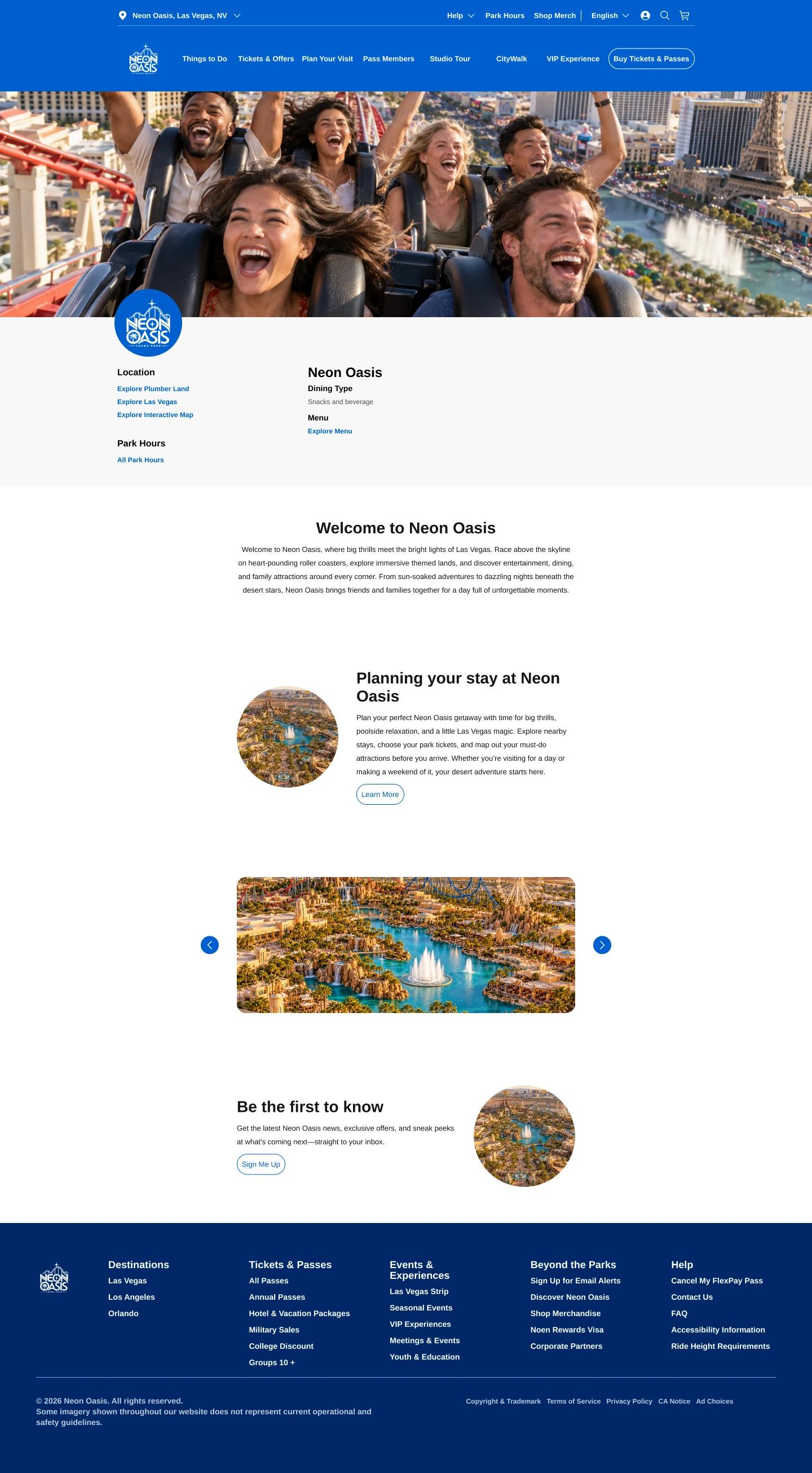
Open full-size Base page (1440×2610 WebP; opens in a new tab)
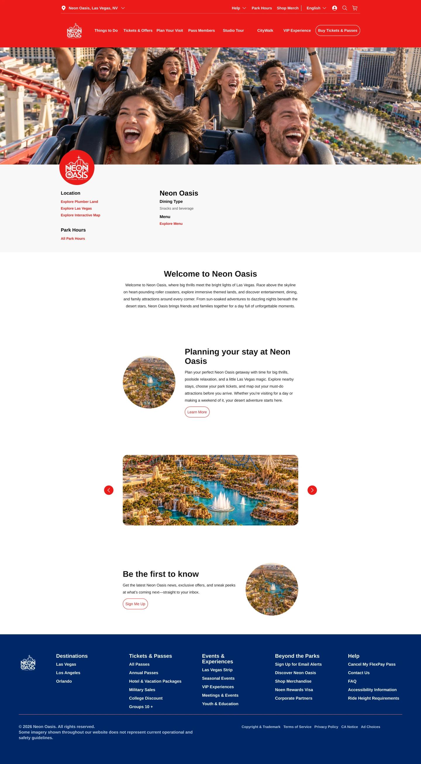
Open full-size Plumber page (1440×2610 WebP; opens in a new tab)
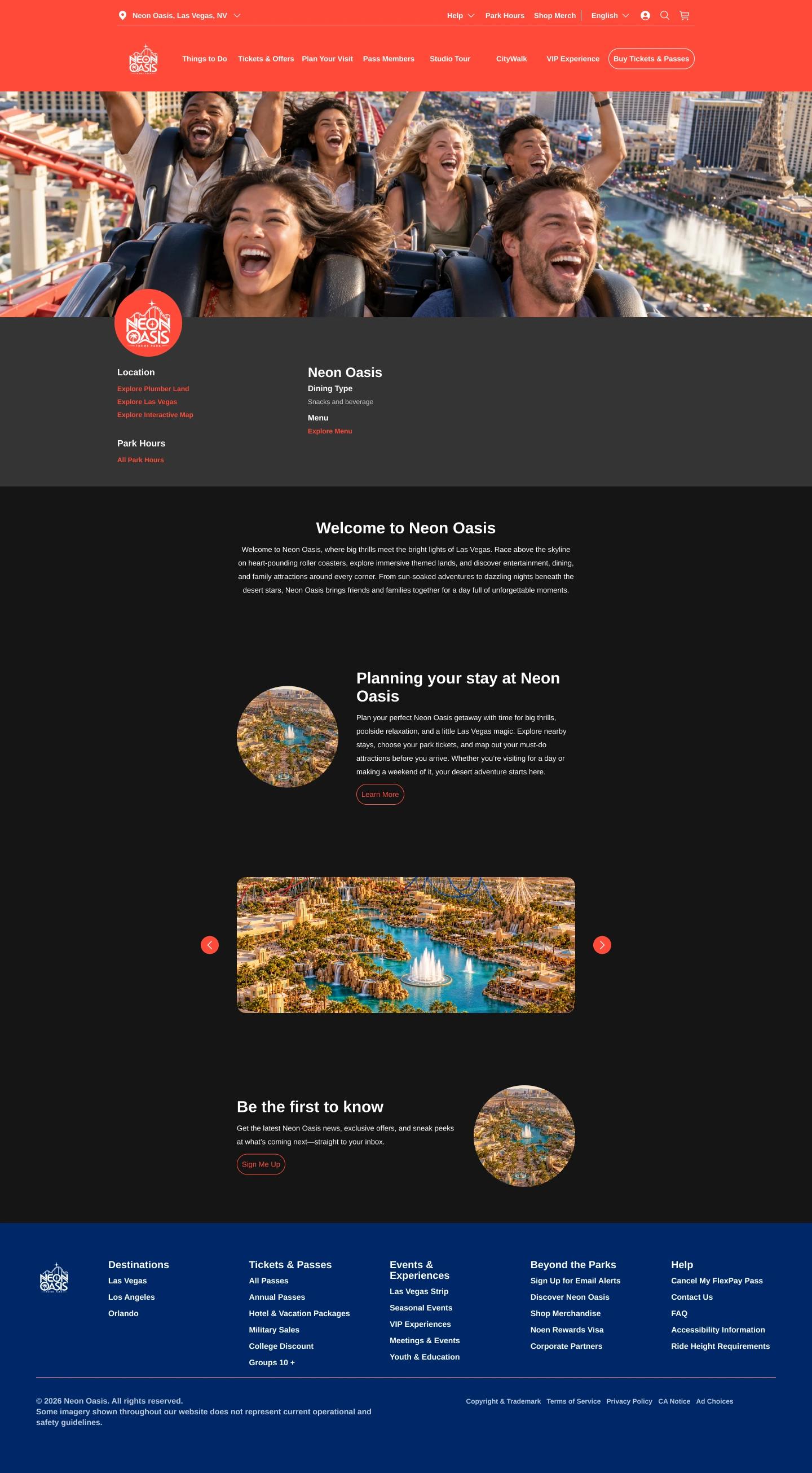
Open full-size Horror page (1440×2610 WebP; opens in a new tab)
Recreated / fictional brand · full views are editable clones, including original token bindings and component instances. The mode specimen illustrates the architecture; it is not a Universal production screenshot.
01 / Advocate
Align the logic in design and production, with support from collaborators.
02 / Implement together
Engineering adapted the existing Tridion CSS to the new architecture.
03 / Validate + ship
Internal QA confirmed the changes were applied. The token architecture shipped.
Chapter 04
Designing across languages
USJ localization complaints revealed breaks in language continuity. I explored reusable language-mode content structure and worked with the translation team to validate the content.
SHIPPED / USJ LOCALIZATION
04A / FROM LANGUAGE BREAKS TO A CONTENT STRUCTURE
01 / Signal
Jira complaints included pages reverting to Japanese.
02 / Design response
Explore reusable language-mode content instead of maintaining independent screen copies.
03 / Validate
Translation-team review grounded language decisions in content expertise.
Before / disconnected copies
A selected language could lose continuity across the journey. Repeated layouts make content drift harder to see.
After / stable structure
Keep navigation, dates and content roles consistent while allowing language-specific strings and text growth.
04B / ONE CONTENT MODEL, LANGUAGE-SPECIFIC VALUES
Shared roles
- page title
- notice
- month label
- selected-date details
Language context
- Japanese · Korean
- Simplified Chinese
- Traditional Chinese
Review boundary
- Translation team validates content
- Design checks expansion, hierarchy and language continuity
営業時間・スケジュール
本日ご来場の皆さまへ
スケジュールは変更される場合があります。
2026年10月
| 日 | 月 | 火 | 水 | 木 | 金 | 土 |
|---|---|---|---|---|---|---|
| 1 | 2 | 3 | ||||
| 4 | 5 | 6 | 7 | 8 | 9 | 10 |
| 11 | 12 | 13 | 14 | 15 | 16 | 17 |
| 18 | 19 | 20 | 21 | 22 | 23 | 24 |
| 25 | 26 | 27 | 28 | 29 | 30 | 31 |
10月19日
08:00–22:00 · 詳細を見る
Illustrative dates and availability
Park hours & schedule
For guests visiting today
Schedules may change. Check the details for your selected date.
October 2026
| Sun | Mon | Tue | Wed | Thu | Fri | Sat |
|---|---|---|---|---|---|---|
| 1 | 2 | 3 | ||||
| 4 | 5 | 6 | 7 | 8 | 9 | 10 |
| 11 | 12 | 13 | 14 | 15 | 16 | 17 |
| 18 | 19 | 20 | 21 | 22 | 23 | 24 |
| 25 | 26 | 27 | 28 | 29 | 30 | 31 |
October 19
08:00–22:00 · View details
Illustrative dates and availability
New editable reconstruction · Japanese and English specimens illustrate structure and text expansion; sample date/hours are illustrative. Source visual references cover Japanese, Korean, Simplified and Traditional Chinese.
Separate the approach from the portfolio artifact.
The existing USJ Figma views were manually reproduced from the shipped site. They are not an implemented Figma variable/data layer. These new editable examples explain the proposed language-mode structure without implying that layer existed in the source file.
Chapter 05
Help guests find—and plan—their day
USJ attraction discovery moved from text lists to filterable cards, while parking moved from static calendars to date-based availability. Global consistency had to make room for local conventions.
SHIPPED / ATTRACTION SEARCH + PARKING
05A / FROM A TEXT LIST TO SCANNABLE, FILTERABLE CARDS
Find your next experience
Showing 2 of 2 attractions.

Thrill rides
Skyline Coaster
Thrill ride · Outdoor
Explore attraction
Fictional titles and content · reconstructed layout
Family
Oasis Adventure
Family experience · Indoor
Explore attraction
Fictional titles and content · reconstructed layout
Attractions
Showing 1 of 2 attractions.
Thrill rides
Skyline Coaster
Thrill ride · Outdoor
Explore attraction
Fictional titles and content · reconstructed layout
Before / text list
Guests had to interpret a list with limited visual hierarchy.
After / cards + filters
Expose the attraction visually and let the guest narrow the set.
05B / FROM A STATIC CALENDAR TO DATE-BASED AVAILABILITY
Parking availability
Choose a date to see availability.
October 2026
| Sun | Mon | Tue | Wed | Thu | Fri | Sat |
|---|---|---|---|---|---|---|
October 19
Available · View parking details
Illustrative dates and availability
Prototype: select 20 for unavailable; select 19 to return.
Sample availability does not represent live parking inventory.
Parking
October 2026
| Sun | Mon | Tue | Wed | Thu | Fri | Sat |
|---|---|---|---|---|---|---|
October 20
Unavailable · Choose another date
Illustrative dates and availability
01 / Global direction
Use recognizable GDS patterns and Orlando’s standardization goals.
02 / Local judgment
Balance shared patterns with Japanese calendar and content conventions.
03 / Delivery boundary
USJ changes shipped. These screens reconstruct the interaction story, not exact production data.
Recreated examples · no invented conversion, search or engagement metrics. Calendar dates, attraction names and availability states are illustrative.
Chapter 06
A player shaped by constraints
For Shanghai, I researched Angular-compatible approaches and proposed a native video experience with captions, related content and defined component states for stakeholder review.
PROPOSED / NOT CONFIRMED SHIPPED
06A / RESEARCH A FEASIBLE PATH, THEN MAKE THE BEHAVIOR REVIEWABLE
01 / Technical research
Investigate Angular-compatible approaches for Shanghai’s constraints.
02 / Design the system
Define player controls, captions, related content and the content/data needs.
03 / Review
Bring the proposal and interaction states to stakeholder review. Launch is unconfirmed.
Poster. Illustrative state / proposal.
DESKTOP / PROPOSED
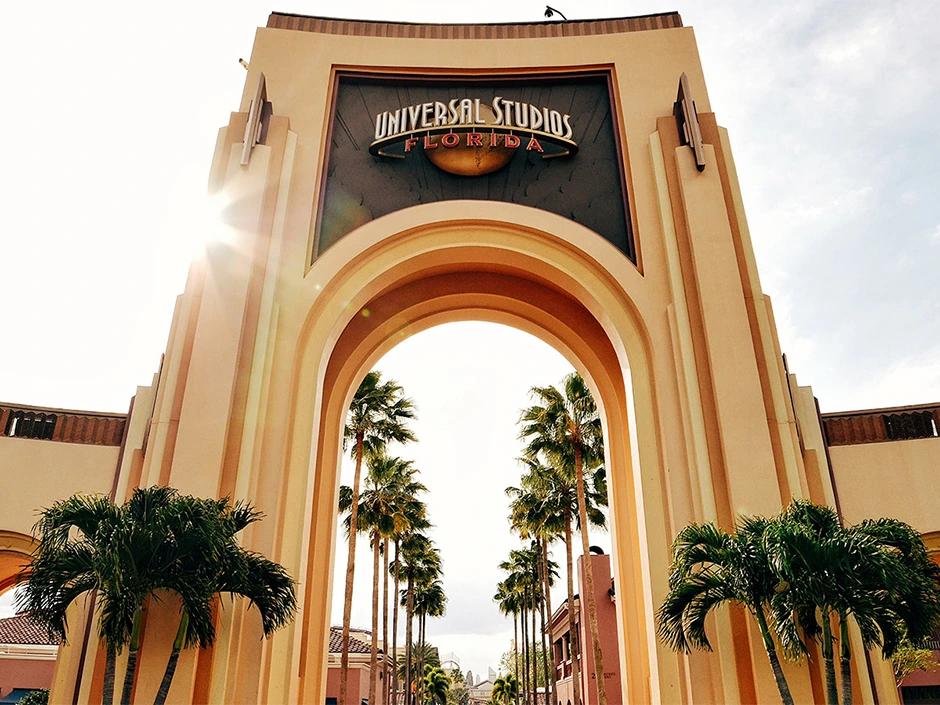
Explore the park
MOBILE / PROPOSED
Explore the park
06B / STATES MAKE THE PROPOSAL CONCRETE
[Caption text appears here]
New reconstructed state specimens · proposed behavior, not recovered production specifications. Media durations and captions are illustrative.
Design beyond the video rectangle.
The proposal included the surrounding content structure and component states so stakeholders could review the experience as a reusable system. Angular research informed feasibility; it did not establish that the player shipped.
CLOSING / ADAPTABLE BY DESIGN
Build a system that can travel.
Make room for the place it lands.
The color architecture and USJ changes shipped. The Shanghai player remained a proposal with launch unconfirmed. Across each, my contribution was connecting scalable foundations with the details of a specific product and market.