
Hilton Honors, from guest experiences to a shared mobile design system
From designing mobile experiences to leading the system behind them.
2021–2025 · Senior UI Designer (contract) → Lead UI Designer → Product Owner, Mobile Design System
I joined Hilton to design the mobile interfaces guests used before and during their stays, then led the multidisciplinary pod that turned recurring decisions into reusable foundations.
Chapter 01
Introduction
Role progression · Retrospective reconstruction
I joined Hilton to design the mobile interfaces guests used before and during their stays. Working across features exposed a recurring problem: teams were solving the same interface decisions independently. I helped turn those decisions into reusable foundations, then led the multidisciplinary pod that prioritized, built, and maintained them.
01 / 2021–2022 · Contract
Senior UI Designer
Guest-facing interfaces · Honors, add-ons, Digital Key, TV
02 / 2022 · Emerging system
Lead UI Designer
Reusable foundations · Figma guidance and feature support
03 / Within 2022–2025 · Mobile system
Product Owner
Roadmap, backlog, prioritization · Multidisciplinary pod and releases
Chapter 02
Designing the experience
When I joined, Hilton’s UX and UI disciplines were separate. UX teams defined the experience. My role was to turn it into polished, high-fidelity interfaces and prototypes. I worked on the Hilton Honors mobile homepage redesign, stay add-ons, and Digital Key, and supported the Hilton TV experience.
Digital Key · Retrospective reconstruction
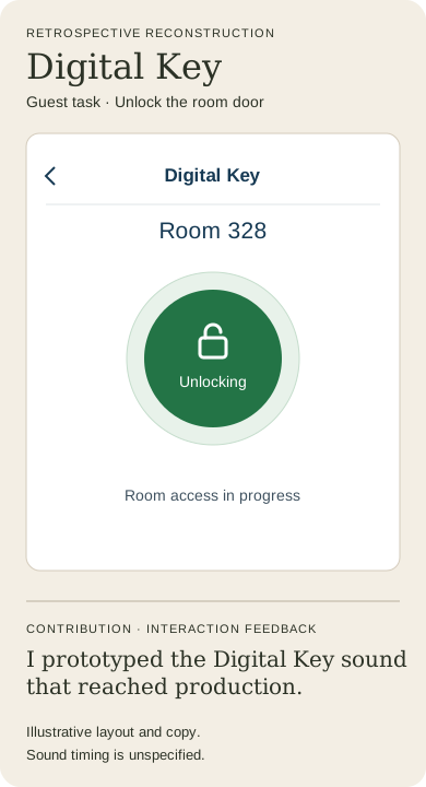
Digital Key called for feedback beyond the screen. I prototyped the sound for the experience, and that sound reached production. The work taught me to consider what guests could hear as well as what they could see when using an interface.
Chapter 03
Recognizing the problem
Across features, I saw teams solve similar interaction problems in different ways. Hilton had no established shared mobile design system at the time. Each new feature brought another opportunity to reconsider controls, states, and handoff details that could have been shared.
I began teaching atomic design and reusable component methods to my immediate team. Those conversations grew into workshops with the wider design organization and discussions with engineering. The feature work gave us concrete examples to discuss together.
Chapter 04
Establishing shared foundations
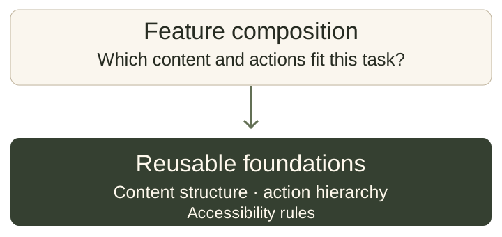
As Lead UI Designer, I became the primary point of contact for the emerging mobile design system. I established reusable foundations, documented components and patterns in Figma, and helped feature teams apply them.
The Honors homepage redesign was an early proving ground for introducing the system into product work. I worked with UX, UI, content, accessibility, iOS, and Android specialists. Directors across UX, UI, iOS, Android, and Mobile Engineering supported formalizing the system and exploring its potential beyond mobile.
A recurring decision was where to draw the boundary: which behaviors should the system define, and which combinations should feature teams own?
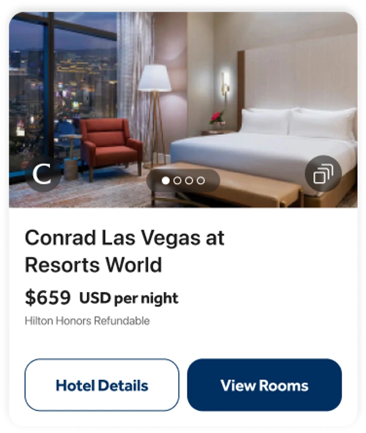
- 01 · Content
- Hotel name, nightly rate, and refundable label.
- 02 · Actions
- Hotel Details and View Rooms appear in the original iOS crop.
- 03 · Accessibility
- The guideline specifies that the title is announced first.
Original iOS Sandbox crop. The card gives the hotel name, rate, and next actions a shared structure. The Card guideline also specifies that screen readers should announce the title first.
View the original Button Group matrix
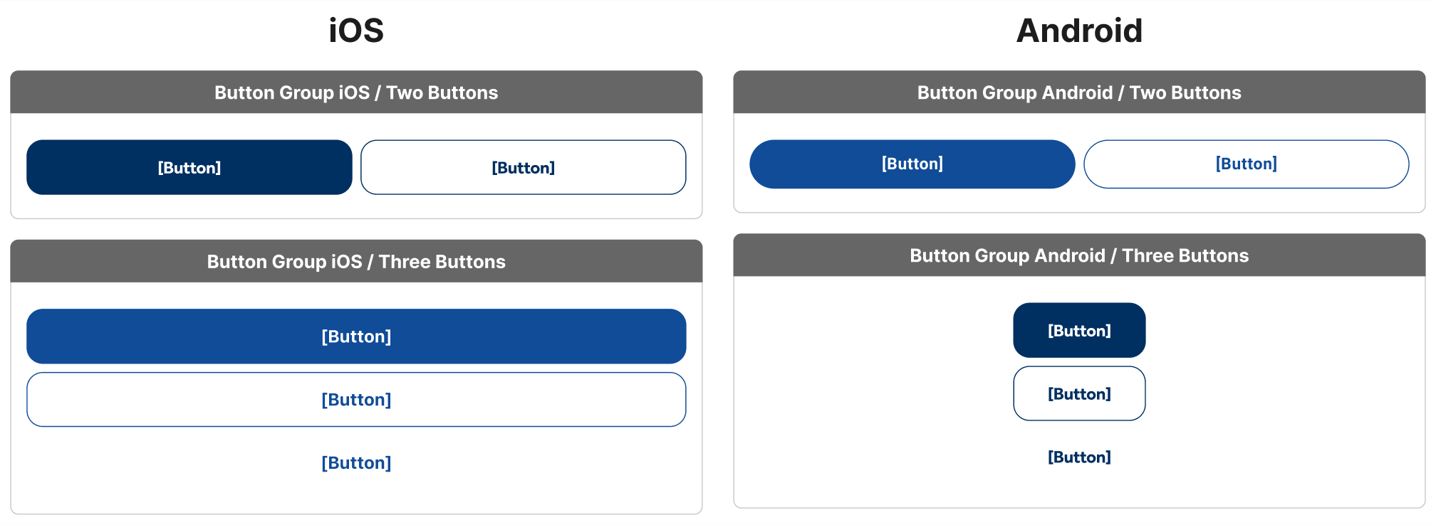
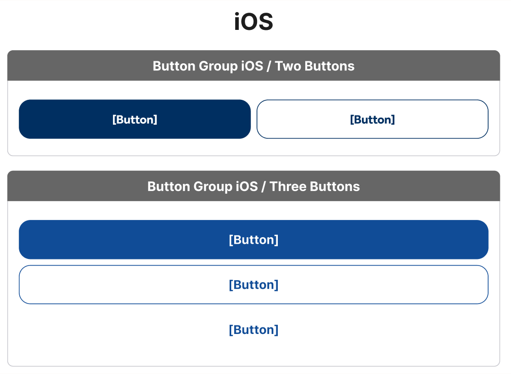
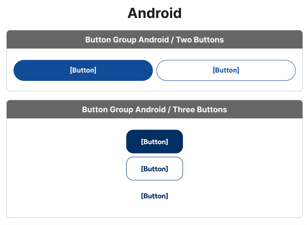
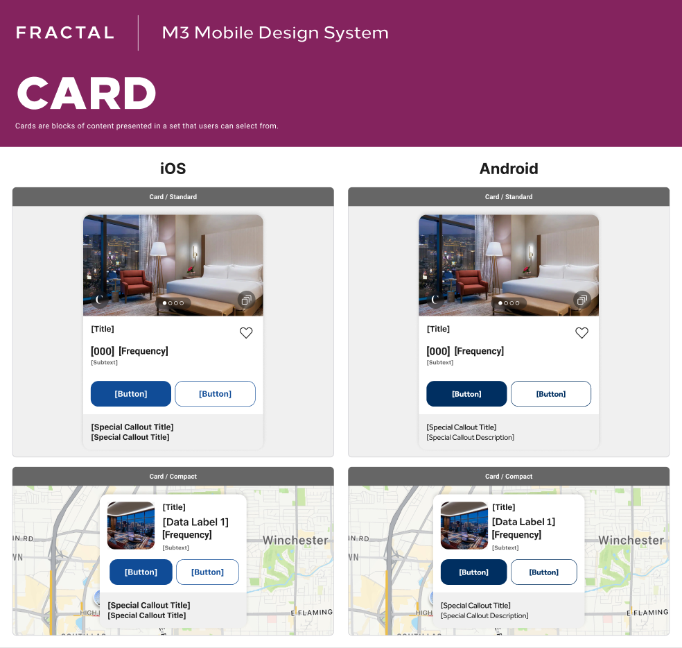
Historical guideline with template labels. [Button] is a historical placeholder.
View populated Button Group, AlertMessage, and DatePicker specimens
SearchBarButton
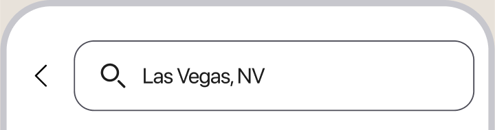
iOS Sandbox only. A verified Android frame in the same filled state was not found.
View the search control close-up

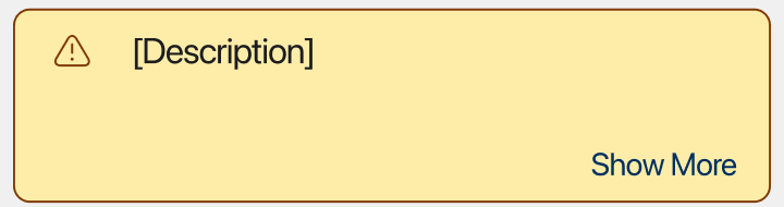
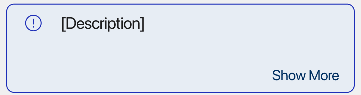
AlertMessage
Warning
The room rate may change before booking.
Show MoreInformation
Check-in begins at 3 p.m.
Show MoreView the original alert specimens
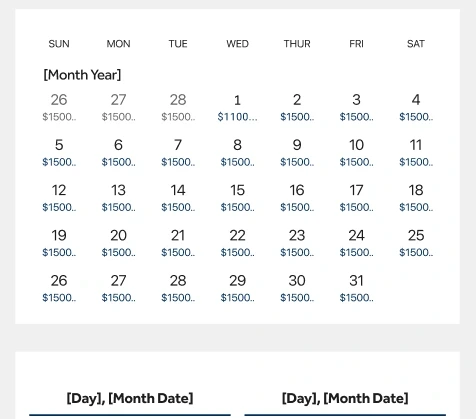
DatePicker
June 2025
View the original calendar and range specimens
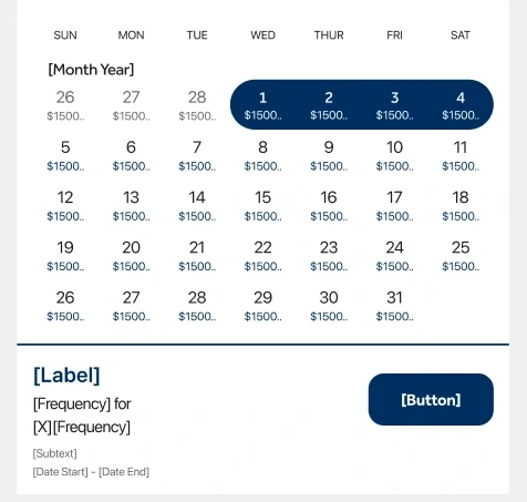
Later parity work also covered ChipRow and related selection patterns. Atomic design was a teaching model for building modular components with defined behavior.
Chapter 05
Recognizing the bottleneck
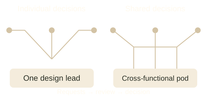
As more teams came to me for guidance, too many decisions depended on my availability. The same arrangement that helped us start the system was becoming a bottleneck. A decision about a shared control could require input on design, content, accessibility, and implementation, yet teams still depended on one person to bring those perspectives together.
That changed what I needed to build. We needed a dedicated team with a shared way to evaluate requests and the authority to make decisions together.
Chapter 06
Building the Design System Pod
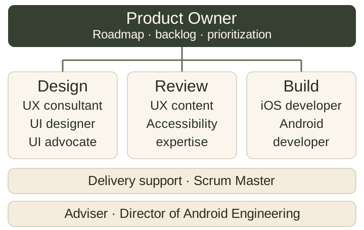
As Product Owner and lead of the Mobile Design System Pod, I coordinated the roadmap, owned prioritization and the backlog, and brought cross-team decisions to the people who could evaluate them. The pod included a UX Design Consultant, UI Designer, UI Advocate, UX Content Expert, Accessibility Expert, iOS and Android developers, and a Scrum Master. A Director of Android Engineering advised me on product ownership and management.
Feature teams had public channels for requests and support. We triaged requests internally, reviewed them weekly, tracked the backlog in Jira, and coordinated capacity through PI planning and proactive conversations with other product managers. The pod evaluated requests across disciplines. Engineers used peer-reviewed pull and merge requests, and we shared changes through Zeroheight guidance, changelogs, and weekly release announcements. Sprint retrospectives helped us adjust the process as the work evolved.
Request to release · Retrospective reconstruction
01
Intake
Feature teams use request and support channels.
02
Triage
The pod reviews requests weekly.
03
Prioritize
Jira backlog, PI planning, and product coordination.
04
Evaluate
Design, content, accessibility, iOS, and Android weigh in.
05
Build & review
Engineers build and peer-review pull and merge requests.
06
Document & release
Zeroheight, changelogs, and weekly announcements.
Retrospective reconstruction of the pod’s request-to-release workflow. Sprint retrospectives fed changes back into the process.
View the original Decision Log template
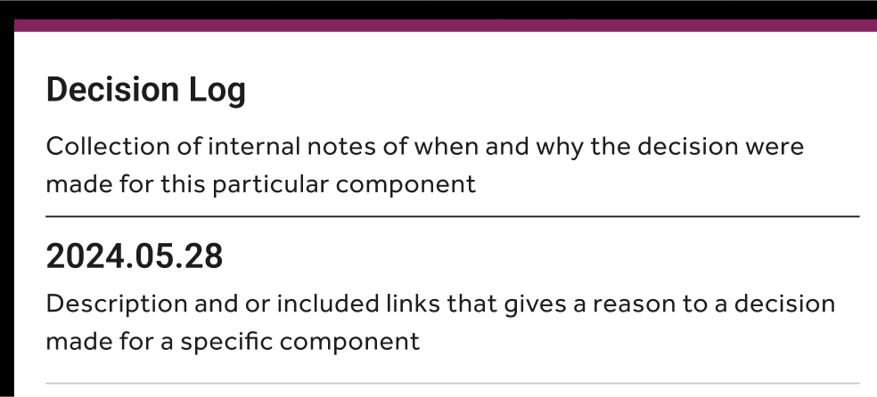
Original Decision Log template. The dated entry is sample template content, not a verified completed decision.
Chapter 07
Outcomes
The pod delivered mobile design foundations, shared iOS and Android repositories, reusable components, guidelines, and contribution tooling.
By the end of my tenure, I estimate that reusable components supported approximately 90% of existing mobile application workflows. This was an estimate of workflow coverage. We were beginning to establish formal component adoption measurement when organizational layoffs ended my tenure.
Engineering leadership reported an approximately 45% improvement in mobile feature delivery speed. The original measurement baseline is unavailable, so I present this as a leadership-reported result.
Chapter 08
Reflection
I started by designing the interface and became the person teams came to for system decisions. My most important lesson was learning to distribute that responsibility. A shared backlog, regular release cadence, and multidisciplinary review gave people the context and authority to make decisions together.
That experience changed how I lead. I still care about how an interface behaves and feels. I also pay attention to the relationships and routines that let a team keep making those decisions after any one designer leaves.